For my Abëcards project, I created a series of vocabulary cards for both youth and adults who want to practice or learn a foreign language. I love languages, and learning new ones, so this project was a lot of fun for me.
In the future, I hope to be able to design cards of differing styles, depending on the target audience and language. To start out with, though, I began with a very clean and modern design, to appeal to the widest audience possible.
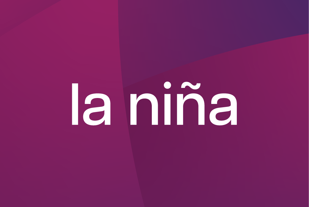
I used a sans-serif font, to ensure maximum legibility.
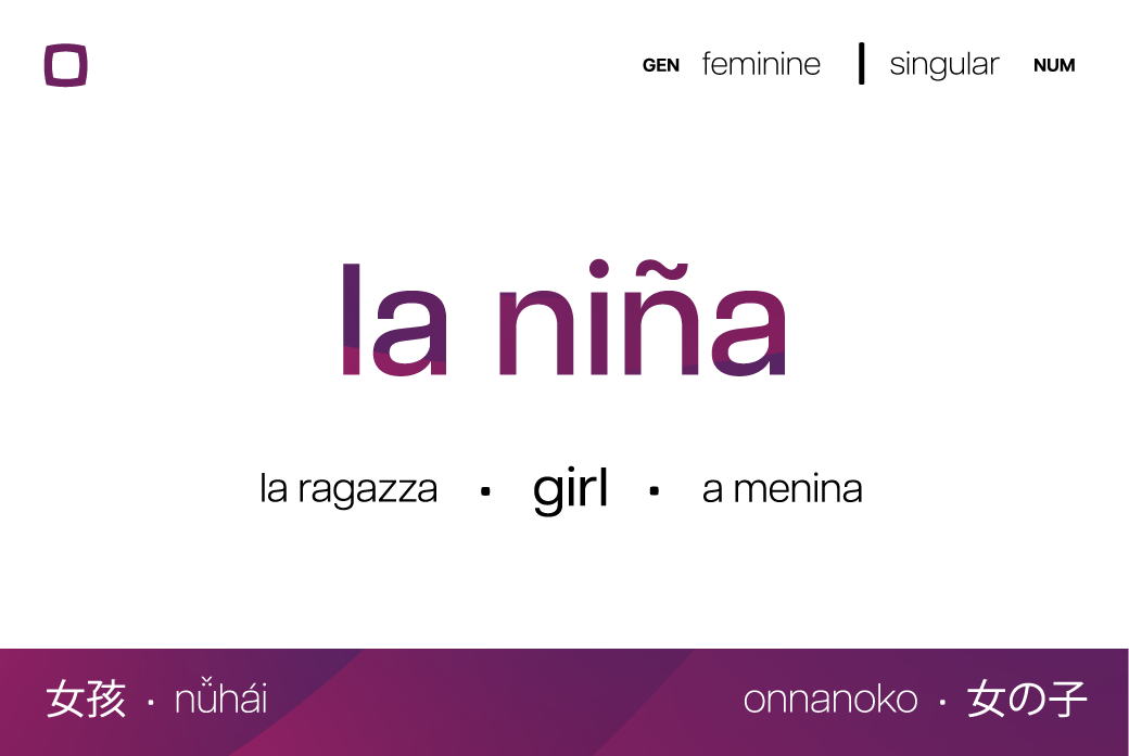
I love all languages, so it was difficult to choose which ones to include. So, I chose the ones I encounter the most on a daily basis. These are only digital roughs, so I apologize in advance if there are any linguistic errors.

Choosing which colors to go with different grammatical categories was difficult, so I tried to view different the parts of speech as considered as parts of a whole, and chose my colors and accordingly.
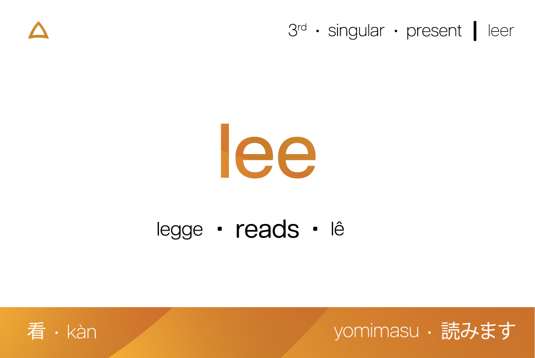
To aid in understanding, I used different shapes to represent different parts of speech, rather than simply labeling them under their various categories.

I endeavored to maintain an overall visual unity among the various aspects of each card.
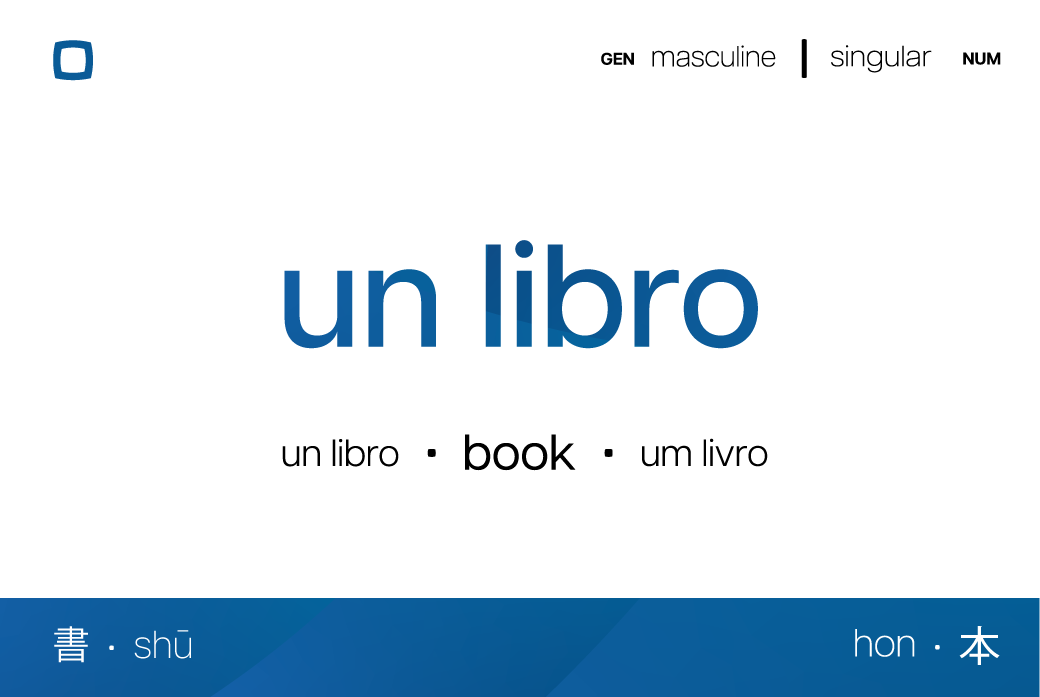
Overall, I think my design solution was quite effective in creating a basic design for vocabulary cards that would aid in language acquisition, in a way that was both aesthetically pleasing as well as useful.
Abëcards concept and design © 2024 by Battersby Design.

